COLOR THEORY: A MONOCHROMATIC COLOR SCHEME
Using a monochromatic color scheme is one of the best ways to understand the use of value. “Mono” means “one”, and “chroma” means “color,” so all you can use is one color with various tints, tones and shades for your painting. If you add white to a hue (another name for ‘color’), it is called a “tint;” if you add gray, it is called a “tone;” and if you add black, it is called a “shade.” So all you have is the darkness and lightness of the color for variety. Sometimes I like to do monochromatic underpaintings for my pastel works – the underneath color sets the mood for the rest of the painting.
To further complicate things, every color has its own value. For instance, yellow is a light value, purple is a dark value. Greens and oranges are middle values. You can see this best by looking at colors through a red glass (or a green glass if looking at red hues). You will be able to see the relative value of the colors that way.
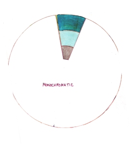
Here is the color wheel image sectioned off so that only a blue-green hue is selected. You can see that the tints and tones are much muted.
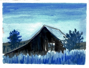
In the example below, I have used the same subject as in the complementary color example, but with a monochromatic color scheme of blue with whites, grays, and blacks. The time of day seems to be early evening, with perhaps a little light left in the sky.
Try this exercise if you like and let me know how it turns out. I highly recommend the book by Stephen Quiller, COLOR CHOICES; MAKING COLOR SENSE OUT OF COLOR THEORY, which I used in my exercises.
Posted on October 20, 2014, in ADVICE TO ARTISTS, COLOR THEORY, COMPOSITION AND DESIGN, IDEAS, PAINTING LANDSCAPES, WHAT TO DRAW IN YOUR SKETCHBOOK and tagged art, color exercises, color schemes, colors, composition, contrast, hues, monochromatic, shades, tints, tones, values. Bookmark the permalink. Leave a comment.
Leave a comment
Comments 0