Blog Archives
3rd Pen and Ink Drawing Lesson
The objective for this lesson was to use ink washes in various tones to shorten the drawing time, even out the values, and pulling the elements together into a cohesive artwork. Pen and ink stokes were to be used mainly for details and texture. Students were to use 8 x 10″ black and white photos for their subject.
All first made a good drawing of the subject on sketchbook paper either free-handed or using a grid. Four small cups were set out with a little water in one, a little more in the second, more water in the 3rd, and the most in the 4th. We put a drop of India ink in each cup, thereby making 4 different values, plus the white of the paper and undiluted ink for the darkest tone.
We worked light to dark with a round watercolor brush, and made sure to let each value dry before adding another. Layering of values could also be used. When all the values were laid in, students used their pens to complete the painting. These really turned out great!


The homework assignment was to draw a still life composition with bottles, vases, etc. but instead of developing the positive shapes, students were to break up the negative shapes with patterns in pen and ink, thereby making the still life objects the negative instead of the positive. Here’s my example of this assignment:

NEW CLASS IN MAUMELLE
 Well, I’m going to teach an art class again — thought I was finished with that, but guess it’s in my “blood.” Beginning September 15 (Thursday) from 1:30 – 3:30, I will be teaching a class on how to compose a work of art at the Maumelle Senior Wellness Center in Maumelle. This is a seven week class, and will include examples, critiques, information, exercises, and perhaps occasional homework. Students will use their own materials, as well as materials provided by the instructor. I’ve had many years of experience teaching this subject, both in high school art classes, children’s classes, and adult classes. A lot of the lessons will be based on the blogs I’ve shared on this site. Cost is $45, and there is a maximum of eight students so call MSWC as soon as possible, if you want to register (501- 851-4344). I’m looking forward to seeing you and sharing my understanding of composition and design principles.
COLOR THEORY: COMPOSITION IN TRIADS

First of all, I’ve had computer problems this week, so I’m late in posting this. I’m back on track however!
If you divide the color wheel equidistantly, you will have a triangle and thusly, a triadic color scheme. This becomes a highly contrasting scheme and could be difficult to pull off! You will need to mix two of the colors together to make semineutrals. Your scheme will be either warm or cool dominant depending on the intense color used. If done well, you will have an exciting color composition.
Use of the three primary colors (red, blue, and yellow) become a triadic color scheme, but some of the other colors are easier to work with. This first example is using Ultramarine Blue, Indian Red, and Hooker’s Green. These correspond to blue-violet, yellow-green, and red-orange on the color wheel. I didn’t use a lot of neutrals in this. so there’s a lot of intensity.

In this next example, I used Manganese Blue, Raw Sienna, and Violet. These relate to blue-green, yellow-orange, and red-violet on the color wheel. I subdued the violet and raw sienna, so that the yellow-orange is dominant. Which one do you like the best? It’s a lot of fun trying out these color exercises, not to mention how much you learn from them. If you’re interested in this, read Stephen Quiller’s book, Color Choices: Making Sense out of Color Theory. That’s where I got my inspiration.

COLOR THEORY: SPLIT-COMPLEMENTARY COLOR SCHEME

The split-complementary color scheme is just what it says: the complement of one color is split on either side so that it is a 3-color scheme. What happens is that one color temperature becomes dominant and the other is subordinate. Another way of looking at is is to select three analogous colors and then look for the complement of the middle color. In this way, a harmonious relationship is provided as well as an accent color that enlivens the composition. This color scheme is found in nature most often with the hues blue, green, and orange.
To choose your colors, ask yourself what mood you want to convey. Cool colors convey a feeling of peace and calm while warm colors could be used to show activity, vibrancy, brightness. One or two colors could be neutralized while the accent color is used in its intensity.
In my first example, I used a split-complementary scheme of yellow, orange-red, and blue violet. The analogous colors where used predominantly, and the blue-violet was subdued and used only sparingly. It’s a hot summer day!

In my second example, I used a split-complementary scheme of red-violet, blue-violet, and yellow. The warms are dominant, and the yellow is partly subdued. A night scene is suggested. This is a good exercise for you to try – let me know how it turns out!

SPOOKY PASTELS

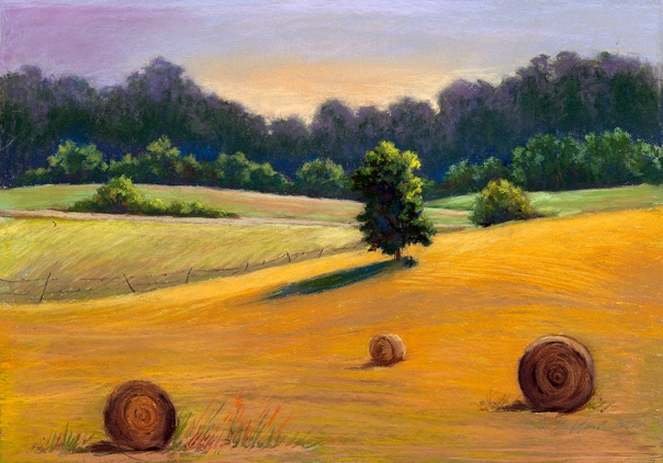
With Halloween on its way, I thought I’d post a couple of strange paintings I’ve made lately. Both of these are in pastel, my favorite medium. You will note that the image above is of the same barn that I’ve been using for the color theory exercises. For some reason, I’m really fond of this scene. However, I tried it in a different value scheme — one suggested by Edgar Whitney in his book on watercolor. This value scheme is a lot of dark with a little light in mid-values. I hadn’t used this scheme deliberately before, and it ended up as a night-time painting — even a little disturbing – who knows what’s lurking inside that old barn! The painting is 12 x 16″ and is unframed – price is $175.

I didn’t intend for this painting to be spooky, either; I was merely playing around with background color – using intense watercolors for the underpainting. The bare tree looms up into the sky, and it looks like a skeleton against the sky, pleading for deliverance! The name of this painting is The Stoic — 24 x 28″ framed and for sale at $475.
COLOR THEORY: A MONOCHROMATIC COLOR SCHEME
Using a monochromatic color scheme is one of the best ways to understand the use of value. “Mono” means “one”, and “chroma” means “color,” so all you can use is one color with various tints, tones and shades for your painting. If you add white to a hue (another name for ‘color’), it is called a “tint;” if you add gray, it is called a “tone;” and if you add black, it is called a “shade.” So all you have is the darkness and lightness of the color for variety. Sometimes I like to do monochromatic underpaintings for my pastel works – the underneath color sets the mood for the rest of the painting.
To further complicate things, every color has its own value. For instance, yellow is a light value, purple is a dark value. Greens and oranges are middle values. You can see this best by looking at colors through a red glass (or a green glass if looking at red hues). You will be able to see the relative value of the colors that way.
Here is the color wheel image sectioned off so that only a blue-green hue is selected. You can see that the tints and tones are much muted.
In the example below, I have used the same subject as in the complementary color example, but with a monochromatic color scheme of blue with whites, grays, and blacks. The time of day seems to be early evening, with perhaps a little light left in the sky.
Try this exercise if you like and let me know how it turns out. I highly recommend the book by Stephen Quiller, COLOR CHOICES; MAKING COLOR SENSE OUT OF COLOR THEORY, which I used in my exercises.
COLOR THEORY: COMPLEMENTARY COLORS
 Colors that are opposite each other on the color wheel, such as red and green, are said to be “complementary.” Notice that that is not “complimentary.” These colors complement each other, acting as opposites. If they are used next to each other, the contrast is intense and disturbing. If one color is mixed with another, the colors blend into each other and are neutralized, or grayed.
Yellow, red, and blue are said to be primary colors, because the pure color cannot be obtained by mixing. The secondary colors are green, orange, and purple. Tertiary colors are yellow orange, red orange, red purple, blue purple, blue green, and yellow green. As any grade school student knows, secondary and tertiary colors are mixed from the primary colors.
The complement of red is green, the complement of blue is orange, and the complement of yellow is purple. But what are the complements of the secondary and tertiary colors? You can figure this out without looking at the color wheel in this manner: If you want to know the complement of blue-green, think – the complement of blue is orange, and the complement of green is red, so the complement of blue-green is orange-red. Likewise, the complement of red-purple would be yellow-green. Understand?
In the next post, I’ll show examples of a small watercolor in complementary colors.
PASTEL PAINTING PROCEDURES
For those pastel painters who like a step-by-step method to painting an artwork, this is for you. I think I got this from Larry Blovits, my first workshop teacher, but I probably added to it over the years. Some useful information is included.
PASTEL PAINTING PROCEDURES
1. SELECT A BALANCED COMPOSITION: Is there a center of interest? A variety of shapes? Forms? Colors? Values? Sizes? Movements? Does your eye lead you from one area of interest to another? Are there clues of depth? Is there a statement to be made?
2. DECIDE ON YOUR GOAL FOR THE PAINTING: What do you want to emphasize? The illusion of depth? The contrast of light against dark? A shape or pattern that is repeated throughout? An emotional feeling? Set a goal and stick to it.
3. DECIDE WHETHER THE FORMAT IS VERTICAL OR HORIZONTAL: Decide on the major divisions of the picture plane – where will the main objects be situated? You may want to lightly sketch in this composition, using a NuPastel stick. Or you may plan by doing a thumbnail sketch or two. If using paper, pad underneath with several other sheets.
4. DRAW THE MAJOR SHAPES OF THE COMPOSITION AS ACCURATELY AS POSSIBLE: Keeping shapes simple at first, work on creating proper proportion of the first shape you put into your picture plane and then measure every other shape’s height and width in proportion to this first shape.
5. MASS IN LOCAL COLOR VALUES: Mass in the foundation colors with hard pastel as close to the value as possible. The colors should be darker and more intense to begin with as they really are. Work from dark to light. Don’t put in any highlights at this point. Working with a darker, more intense color creates a stronger foundation of color as well as providing contrast for modeling with lighter colors without bleaching or “chalking out” the color.
Some artists put a hint of their lightest and their darkest values in at this point so that the range of values can be adjusted. Begin to solve basic color problems. Work on the whole picture. You can always dull an intense color, but not vice-versa. You can also lighten the dark, but not vice-versa.
6. ADD SHADE AND SHADOW: Establish the dark values – look for purples and blues in the shadow areas. Use black if your colors are not dark enough, but always layer a red, green, blue or purple dark over it so that it doesn’t look so dead. Squint your eyes or take off your glasses so that you can see the values. Think in terms of pattern, shape, and value at first.
7. REWORK AS NEEDED TO INCLUDE LIGHT, VOLUME, TEXTURES, AND DEPTH: You may want to use fixative spray between layers of pastel. Use hard and semi-hard pastels at this point. DO NOT WORK ON THE DETAILS AS YET; THIS IS THE LAST STEP IN DEVELOPING THE ARTISTIC STATEMENT. Take your time. Avoid blending – you can use a hard pastel to glaze or blend over colors. Glazing with a complement makes the colors vibrate.
8. REDUCE CONTRAST IN THE BACKGROUND, INCREASE CONTRAST IN THE FOREGROUND. Contrast should be strong in the foreground and weak in the background for the illusion of space (Aerial Perspective). If the light is warm, the shadows should be cool, and vice versa. Have little contrast where you want the objects to recede. You only want one focus, so some things need to be unclear of hard to see (Refraction). Play with lost and found edges, soft and hard edges.
9. RESTATE ELEMENTS FOR FURTHER CLARITY: Add color accents where needed, and add foreground detail. Leave some calligraphic strokes, and arbitrary colors for pizzazz!
10. ELIMINATE MISTAKES AT ANY TIME: Cover over a color with its complement, and then change the color. You can also remove layers of pastel with a stiff brush.
11. ABOVE ALL – take your time. Don’t try to put in the excitement too early. Speed is not important; focus and perseverance is.
CONTRAST – AN IMPORTANT PRINCIPLE OF DESIGN
One of my strongest concerns in making a painting is CONTRAST. Contrast can be achieved in many different ways:
1. CONTRAST OF VALUE: This is the opposition between white and black and their immediate gradations when mixed with various colors. If a painting or drawing has high value contrast, it pr0bably has at least 6 different variations from light to dark. Strong light or sunlight makes for a wide range of contrast, while cloudy days and diffused light makes for a limited range of contrast.
2. CONTRAST OF HUE: This is the contrast of hues (colors) in the same values against each other. For example, the action of a bright red on a bright green background causes optical effects resulting from the contrast. If a painting has light values,but different hues, it is said to be high key. If it has dark values, but different hues, it is said to be low key.
3. CONTRAST OF INTENSITY: This is the contrast of a clean color against a dirty one, or intense color against neutral. A little bit of color at its maximum intensity (strength) against a grayed down hue produces a very effective type of harmony.
4. CONTRAST OF TRANSPARENCY: Color can be transparent like colored glass, semi-transparent like cloudy glass, or opaque like a thick layer of house paint. Transparent color like the stained glass of a cathedral, is the most powerful of all. In the same way, transparent paint is more powerful than an opaque passage. This works best in watercolor, of course.
5. CONTRAST OF TEMPERATURE: Consciously or unconsciously, we are aware some colors are warm (red, yellow, and orange) while others are cold (blue, green). A single hue may vary in temperature: a purplish blue is warmer than a greenish blue, and a purplish red is cooler than an orange red. To identify whether a hue is warm or cool, think about how much red or blue is in it. Warm colors have certain emotional overtones that differ from the emotions evoked by cool colors, so use thus principle when you are seeking to imply a certain mood.
6. CONTRAST OF COMPLEMENTS: Colors which are diametrically opposite one another on the color wheel are called complementaries, and they have the power to bring out the maximum effectiveness of their opposites when placed side by side. Thus, yellow will emphasize an adjacent purple; red reinforces a nearby green, etc. The remarkable fact about complementaries is that the nerves in the eye will create an illusion of the opposite color. Therefore, a bright patch of red will seem to suffuse the surrounding area with green.
