Blog Archives
NEW CLASS IN MAUMELLE
 Well, I’m going to teach an art class again — thought I was finished with that, but guess it’s in my “blood.” Beginning September 15 (Thursday) from 1:30 – 3:30, I will be teaching a class on how to compose a work of art at the Maumelle Senior Wellness Center in Maumelle. This is a seven week class, and will include examples, critiques, information, exercises, and perhaps occasional homework. Students will use their own materials, as well as materials provided by the instructor. I’ve had many years of experience teaching this subject, both in high school art classes, children’s classes, and adult classes. A lot of the lessons will be based on the blogs I’ve shared on this site. Cost is $45, and there is a maximum of eight students so call MSWC as soon as possible, if you want to register (501- 851-4344). I’m looking forward to seeing you and sharing my understanding of composition and design principles.
WORKING WITH PERSPECTIVE – AERIAL OR ATMOSPHERIC PERSPECTIVE
Well, I just realized that I had not posted anything about working with perspective — both aerial and linear. This is an omission my teaching career couldn’t withstand! So I’m going to write a few posts about this subject before giving up!
If you are a realistic painter, or just want to show some depth in your paintings, you need to know something about perspective.
THERE ARE TWO KINDS OF PERSPECTIVE: AERIAL AND LINEAR
AERIAL PERSPECTIVE OR ATMOSPHERIC PERSPECTIVE: If you have drawn or painted a still life subject, you probably wanted to show these objects in space. It was shallow space, of course, but was still important. In a landscape, aerial perspective is most important, since you usually have a foreground, a middle ground, and a background. How do you effectively represent these different planes?
AERIAL PERSPECTIVE INCLUDES THESE ELEMENTS:
- OVERLAPPING
- DETAIL
- VALUE
- INTENSITY
- POSITION
- SIZE.
If you look at two objects in space that are similar, but one is farther away than the other, what happens? The one farther away looks smaller, lighter in value, lower in intensity, not as clearly defined, and may be overlapped by the one in front. Take a look at this example:

How do you know which tree is the closest even though the other trees may be the same size? It is larger, close to the bottom of the picture plane, in more detail, darker, and overlaps the trees and mountains in the distance. What happens to the trees and mountains in the distance? They are lighter in value, less intense, show no detail, are much smaller. The mountains in particular are low in intensity, appearing more lavender and gray.
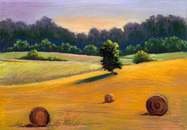
 Here’s is another example: In this painting, we know that the hay bale on the bottom left is much closer to the viewer than the others because of its position. Is there a definite foreground, middle ground, and background here? The foreground hill is more golden (more intense) than the three other hills as they move backward in space. It’s important to look closely at the natural landscape to see how this works.
My next posts will be about linear perspective — this is what happens when people start putting buildings, houses, barns, etc. in the landscape!
COLOR THEORY: COMPOSITION IN TRIADS

First of all, I’ve had computer problems this week, so I’m late in posting this. I’m back on track however!
If you divide the color wheel equidistantly, you will have a triangle and thusly, a triadic color scheme. This becomes a highly contrasting scheme and could be difficult to pull off! You will need to mix two of the colors together to make semineutrals. Your scheme will be either warm or cool dominant depending on the intense color used. If done well, you will have an exciting color composition.
Use of the three primary colors (red, blue, and yellow) become a triadic color scheme, but some of the other colors are easier to work with. This first example is using Ultramarine Blue, Indian Red, and Hooker’s Green. These correspond to blue-violet, yellow-green, and red-orange on the color wheel. I didn’t use a lot of neutrals in this. so there’s a lot of intensity.

In this next example, I used Manganese Blue, Raw Sienna, and Violet. These relate to blue-green, yellow-orange, and red-violet on the color wheel. I subdued the violet and raw sienna, so that the yellow-orange is dominant. Which one do you like the best? It’s a lot of fun trying out these color exercises, not to mention how much you learn from them. If you’re interested in this, read Stephen Quiller’s book, Color Choices: Making Sense out of Color Theory. That’s where I got my inspiration.

DECEMBER EXHIBIT

THIS IS MY HOME – an exhibit of my Arkansas landscapes in pastel and acrylic is currently showing at 1st Presbyterian Church at 4th and Maple in North Little Rock during December. A reception is planned for Dec. 19 from 5-8 pm. I hope you can come – would love to see you and talk about my artwork! I have over 20 paintings in the show, some early ones, and my latest works as well.
COLOR THEORY: SPLIT-COMPLEMENTARY COLOR SCHEME

The split-complementary color scheme is just what it says: the complement of one color is split on either side so that it is a 3-color scheme. What happens is that one color temperature becomes dominant and the other is subordinate. Another way of looking at is is to select three analogous colors and then look for the complement of the middle color. In this way, a harmonious relationship is provided as well as an accent color that enlivens the composition. This color scheme is found in nature most often with the hues blue, green, and orange.
To choose your colors, ask yourself what mood you want to convey. Cool colors convey a feeling of peace and calm while warm colors could be used to show activity, vibrancy, brightness. One or two colors could be neutralized while the accent color is used in its intensity.
In my first example, I used a split-complementary scheme of yellow, orange-red, and blue violet. The analogous colors where used predominantly, and the blue-violet was subdued and used only sparingly. It’s a hot summer day!

In my second example, I used a split-complementary scheme of red-violet, blue-violet, and yellow. The warms are dominant, and the yellow is partly subdued. A night scene is suggested. This is a good exercise for you to try – let me know how it turns out!

COLOR THEORY: A COMPOSITION IN ANALOGOUS COLOR SCHEME

COLORS THAT ARE NEXT TO EACH OTHER ON THE COLOR WHEEL ARE SAID TO BE ANALOGOUS COLORS
The colors featured here are blue-green, green, and yellow-green. Colors that are next to each other on the color wheel present a very harmonious, related color scheme. One color needs to be dominant, another as subordinate, and the other should be in between. Lighter and darker values as well as their neutrals can be used. The colors you choose can express different moods – for example, colors on the red side of the wheel can express warmth, joy, excitement. Paintings in which the colors have all been neutralized can suggest a mood of a foggy, misty, or rainy landscape. In the study below, I chose to use yellow, yellow-orange, and orange as my three analogous colors. Yellow is dominant, orange is subordinate, and yellow-orange is the intermediate.
As it states on the left — use of analogous colors lead to a “harmonious but potentially boring” color scheme. As you can see in my example below, it would be much better if another accent color had been used — maybe a bright blue for interest! Remember, these are just studies — learning how to use different color schemes — don’t be tied down to them!

SPOOKY PASTELS

With Halloween on its way, I thought I’d post a couple of strange paintings I’ve made lately. Both of these are in pastel, my favorite medium. You will note that the image above is of the same barn that I’ve been using for the color theory exercises. For some reason, I’m really fond of this scene. However, I tried it in a different value scheme — one suggested by Edgar Whitney in his book on watercolor. This value scheme is a lot of dark with a little light in mid-values. I hadn’t used this scheme deliberately before, and it ended up as a night-time painting — even a little disturbing – who knows what’s lurking inside that old barn! The painting is 12 x 16″ and is unframed – price is $175.

I didn’t intend for this painting to be spooky, either; I was merely playing around with background color – using intense watercolors for the underpainting. The bare tree looms up into the sky, and it looks like a skeleton against the sky, pleading for deliverance! The name of this painting is The Stoic — 24 x 28″ framed and for sale at $475.
COLOR THEORY – THE COLOR WHEEL
 Here is an example of the well-known color wheel. I painted this in watercolor several years ago, and it still comes in handy in composing works and in teaching students about color. The colors to the right of the wheel are said to be “warm” colors, and the colors to the left are said to be “cool” colors. The outer circle represents the undiluted color, the first inner circle represents what happens when white is added to the major color, and the inner circle represents what happens when colors opposite to each other are mixed. The hues (colors) thus mixed are neutralized.
The hue at the top of the circle is yellow, to its right is yellow-orange, then orange, then red-orange, then red. Continuing around the rest of the circle is red-purple, purple, blue-purple, blue, blue-green, green, and lastly yellow-green. I’m sure most of you already know about this, but I’m starting out with the basics. In the following weeks, I’ll elaborate and show examples of different color schemes that can be produced from the knowledge of the color wheel.
There are other versions of the color wheel and later on, I’ll write about some of those as well. So please follow my blogs for the next month or so to get the “whole picture!”
CONTRAST – AN IMPORTANT PRINCIPLE OF DESIGN
One of my strongest concerns in making a painting is CONTRAST. Contrast can be achieved in many different ways:
1. CONTRAST OF VALUE: This is the opposition between white and black and their immediate gradations when mixed with various colors. If a painting or drawing has high value contrast, it pr0bably has at least 6 different variations from light to dark. Strong light or sunlight makes for a wide range of contrast, while cloudy days and diffused light makes for a limited range of contrast.
2. CONTRAST OF HUE: This is the contrast of hues (colors) in the same values against each other. For example, the action of a bright red on a bright green background causes optical effects resulting from the contrast. If a painting has light values,but different hues, it is said to be high key. If it has dark values, but different hues, it is said to be low key.
3. CONTRAST OF INTENSITY: This is the contrast of a clean color against a dirty one, or intense color against neutral. A little bit of color at its maximum intensity (strength) against a grayed down hue produces a very effective type of harmony.
4. CONTRAST OF TRANSPARENCY: Color can be transparent like colored glass, semi-transparent like cloudy glass, or opaque like a thick layer of house paint. Transparent color like the stained glass of a cathedral, is the most powerful of all. In the same way, transparent paint is more powerful than an opaque passage. This works best in watercolor, of course.
5. CONTRAST OF TEMPERATURE: Consciously or unconsciously, we are aware some colors are warm (red, yellow, and orange) while others are cold (blue, green). A single hue may vary in temperature: a purplish blue is warmer than a greenish blue, and a purplish red is cooler than an orange red. To identify whether a hue is warm or cool, think about how much red or blue is in it. Warm colors have certain emotional overtones that differ from the emotions evoked by cool colors, so use thus principle when you are seeking to imply a certain mood.
6. CONTRAST OF COMPLEMENTS: Colors which are diametrically opposite one another on the color wheel are called complementaries, and they have the power to bring out the maximum effectiveness of their opposites when placed side by side. Thus, yellow will emphasize an adjacent purple; red reinforces a nearby green, etc. The remarkable fact about complementaries is that the nerves in the eye will create an illusion of the opposite color. Therefore, a bright patch of red will seem to suffuse the surrounding area with green.
