Blog Archives
3rd Pen and Ink Drawing Lesson
The objective for this lesson was to use ink washes in various tones to shorten the drawing time, even out the values, and pulling the elements together into a cohesive artwork. Pen and ink stokes were to be used mainly for details and texture. Students were to use 8 x 10″ black and white photos for their subject.
All first made a good drawing of the subject on sketchbook paper either free-handed or using a grid. Four small cups were set out with a little water in one, a little more in the second, more water in the 3rd, and the most in the 4th. We put a drop of India ink in each cup, thereby making 4 different values, plus the white of the paper and undiluted ink for the darkest tone.
We worked light to dark with a round watercolor brush, and made sure to let each value dry before adding another. Layering of values could also be used. When all the values were laid in, students used their pens to complete the painting. These really turned out great!


The homework assignment was to draw a still life composition with bottles, vases, etc. but instead of developing the positive shapes, students were to break up the negative shapes with patterns in pen and ink, thereby making the still life objects the negative instead of the positive. Here’s my example of this assignment:

NEW CLASS IN MAUMELLE
 Well, I’m going to teach an art class again — thought I was finished with that, but guess it’s in my “blood.” Beginning September 15 (Thursday) from 1:30 – 3:30, I will be teaching a class on how to compose a work of art at the Maumelle Senior Wellness Center in Maumelle. This is a seven week class, and will include examples, critiques, information, exercises, and perhaps occasional homework. Students will use their own materials, as well as materials provided by the instructor. I’ve had many years of experience teaching this subject, both in high school art classes, children’s classes, and adult classes. A lot of the lessons will be based on the blogs I’ve shared on this site. Cost is $45, and there is a maximum of eight students so call MSWC as soon as possible, if you want to register (501- 851-4344). I’m looking forward to seeing you and sharing my understanding of composition and design principles.
USING PHOTO REFERENCES
PAINTING FROM PHOTOS
The photo is the beginning, not the end. We use photographs as inspiration, to save time, and a vehicle for our thoughts, ideas, and feelings. Ever since the camera came into being, artists have used photographs as a tool: Vermeer, Holbein, Van Dyke, Caravaggio, Ingres to name a few. They didn’t use the photograph as an image to be copied, however, but to change it in some way to make it unique to themselves, such as exaggeration, distortion, adding several images to make a new composition, changing values and hues. We must do the same.
The photo we’re using doesn’t have to be perfect, detailed, or colorful. The photo is for REFERENCE, only, not for DUPLICATION. I keep a “morgue” of photos I have taken or torn out of magazines and newspapers for easy references. As the late Maggie Price suggested, sometimes it’s a good idea to use a less than perfect or detailed photograph because then the artist must fill in with his/her own ideas.
Most of the photos you’ve seen have too much detail. The values in photos are also darker than the original scene and do not have the subtle nuances you can see in a landscape. It’s always much better to paint from life for this reason. Learn how to make drastic changes by simplifying, flattening the space, finding a different viewpoint, using different hues, values, and textures, and adding or subtracting shapes and emphasizing the mood. Above all, try out different versions in your sketchbook. The more you change the photo, the more you make it your own.
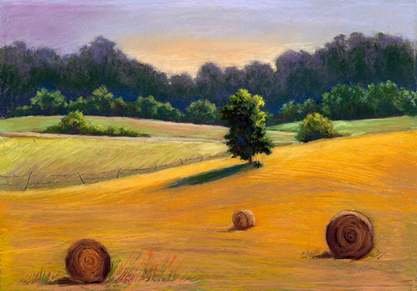
MAKE DECISIONS WITH THUMBNAIL SKETCHES

When starting a landscape, especially if in plein air, it is a good idea to pre-plan with some compositional sketches. Even though these are called “thumbnail sketches,” they’re really quite larger than a thumbnail. These sketches are about 3 x 5″ in size. I made three of them on the same sheet of sketchbook paper before deciding how to proceed. You want to ask yourself these questions: 1. Do I want a horizontal or a vertical format; 2. Do I want to show more foreground (high horizon line), or more sky area (low horizon line); 3. How can I reduce the scene to 5 shapes or less? To simply and concentrate on large shapes only, pull all the areas that are close in value into one shape, omit the details, and shade your sketch with only 4 values — light, medium light, medium, and dark or medium dark. You may have to squint your eyes or take off your glasses to do this! Doing these steps forces you to look at the subject as a simplified pattern of light and dark shapes. After all, the large shapes in a painting are what make a GOOD PAINTING! I chose the second sketch from above to use as my subject for a pastel painting.
FACES, FACES

Make a format about 7 x 9″ in your sketchbook. Start drawing a face you’ve seen in a newspaper or magazine article somewhere in the center of your sketchbook page. Then start to add faces on top of faces — all sizes, shapes, genders, ages, ethnic groups, and poses superimposing and overlapping each other. These should be purely imaginative — don’t worry if they don’t look accurate–that’s not the point. Keep going until you’ve used up most of the paper. Fill in negative shapes with dark values. Use either pen and ink, charcoal, or pencil.
Zentangles and Zendalas
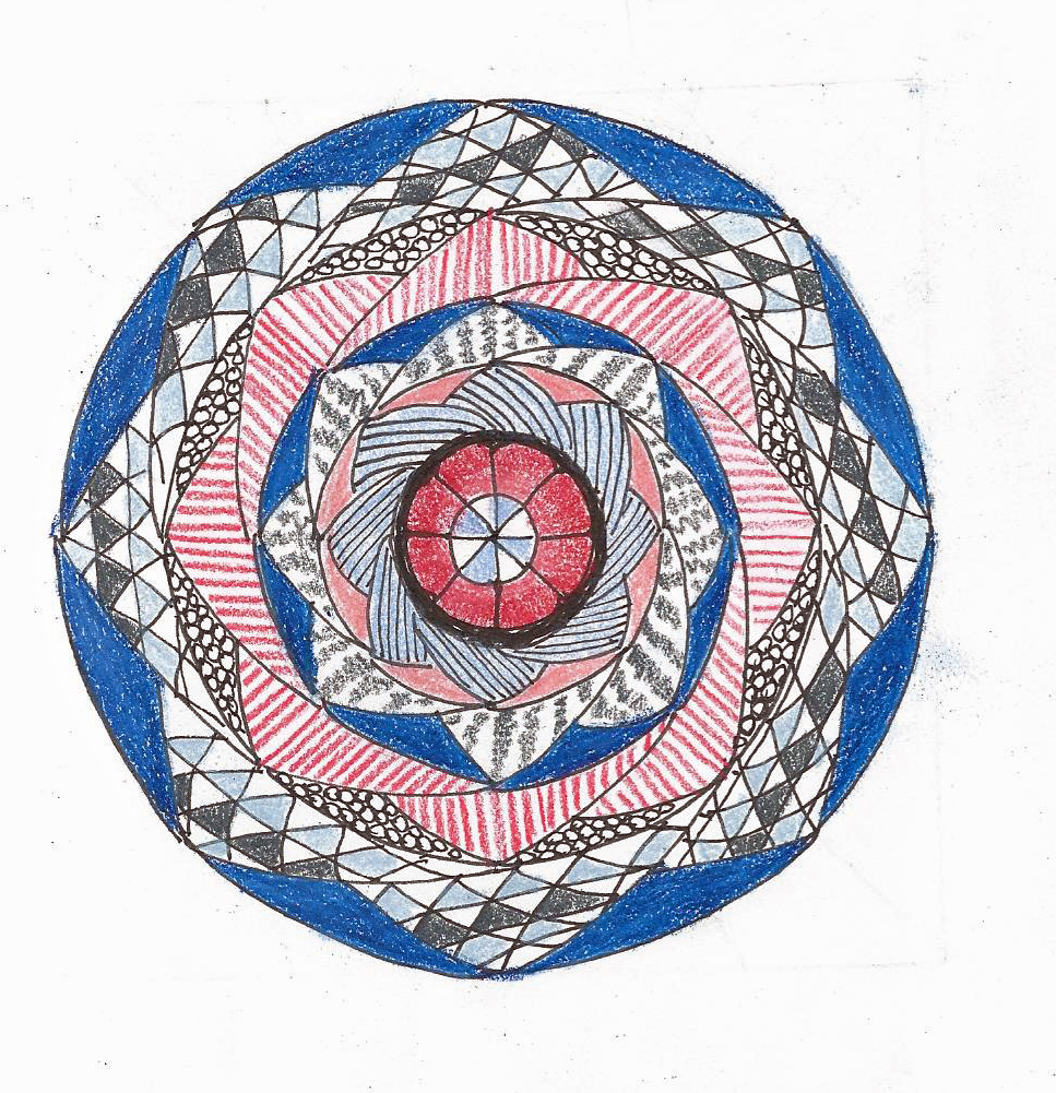
I have been drawing zentangles for about a year in my sketchbook, and also using them in making notecards with scriptural passages. The Zentangle is a method of drawing patterns and repetitions in shapes that is both enjoyable and meditative. All one has to have is a pen and/or pencil, some drawing paper, and time to sit and draw. The concept was created by Maria Thomas, a calligrapher in 2005 when she realized that drawing patterns on her manuscripts caused her to relax and focus on one thing. Many books can be found about zentangling, and countless UTube videos are available.
Instead of a the usual square format, the above drawing is in the form of a mandala — an ancient symbol of oneness. Use a compass and a protractor to divide a circle into 8 equal sections. Begin your design from the center outward. With a pencil, draw a series of circles about 1/2″ apart from the center to the edge. Then use the intersecting grid to make symmetrical patterns all the way to the edge of the circle. You can complete this with pen and ink, or use colored pencil or watercolor pencils to embellish. Let me know if you try this, and if it’s as much fun for you as it is for me!
Related articles
- What is Zentangle? (imake.gg)
- How to make glitter Zentangles from the book The Art of Zentangle (craftside.typepad.com)
- Review: The Art of Zentangle-50 Inspiring Drawings, Designs & Ideas for the Meditative Artist (lifeimitatesdoodles.wordpress.com)
